
Logos
Types of Logos
There are 7 types of logos but what type should you choose for your business? Before you pick your favourite type of logo let me stop you. Who are we creating this logo for? Not you. It’s for your target audience. So what logo type would they be attracted to? What logo type effectively expresses your brand’s personality and the role it plays in your target customer’s life?
Lettermark Logo
If your business name is often abbreviated, like KFC, H&M, IKEA, and HBO, then a lettermark logo might be the one for you. Lettermark logos are simple, and allow your business name to instantly be remembered by their initials.
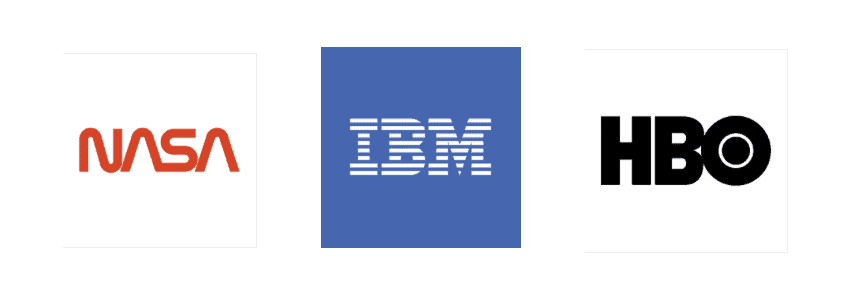
Brands that have long multiple word names such as NASA (National Aeronautics and Space Administration) and HBO (Home Box Office), use initials so that their dream clients remember their name easier.Condensing the business name into initials will help simplify your design and likewise customers will have an easier time recalling your business and your logo.
It is important to note however that some brands whose name is not abbreviated may still use a lettermark logo. Take Louis Vuitton and Cartoon Network for example, they use a lettermark logo, even though people don’t refer to the brands as LV or CN.
Wordmark Logo
Does your brand have a catchy name that your dream clients just can’t get out of their head? Then a wordmark logo may be the perfect logo type for you!
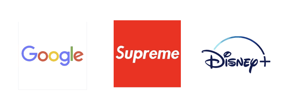
A wordmark logo is also a font-based logo which uses your business’s entire name in the logo. Brands like BrandPlan, Google and FedEx have names that easily roll off the tongue, so why not create a logo for that memorable name?
Even if your brand has a longer name you may want to use a wordmark logo to help make your brand iconic just like The New York Times or American Express do.
Watermark logos can be a good idea for new brands who want to get their name out there or brands who have a distinctive name which differentiates their product. For example, Dollar Shave Club uses a wordmark logo because the company’s pitch is in its name.
Since Wordmark and Lettermark logos primarily use fonts as the visual expression, it is highly important that you use typography that communicates exactly what your brand is about.
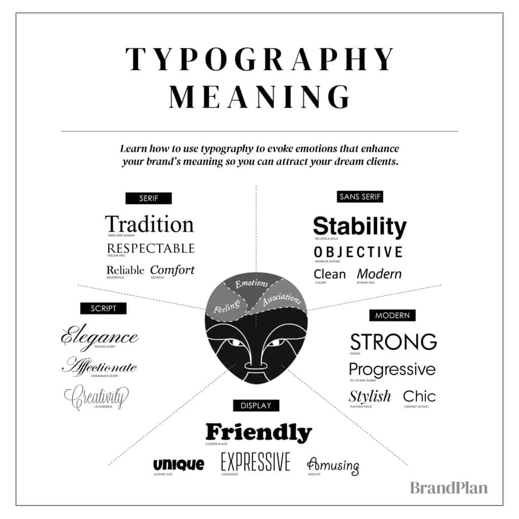
Choosing a typography that evokes a strong psychological message will serve as the first impression in your dream clients mind.
As the graphic above demonstrates, different fonts have a different psychological effect on your dream clients mind.
Please refer back to your brand archetype for the suggested typography that is best for your brand.
Both lettermark and wordmark logos are easy to replicate across marketing material and branding thus making them highly adaptable options for an adapting brand.
While lettermark and wordmark logos seem very simplistic, there is a tremendous amount of nuance needed in the design for it to evoke the right emotions in your dream client’s mind. So we recommend using a professional who can create a great wordmark or lettermark logo which is in line with the rest of your visual expression.
Symbol Logo
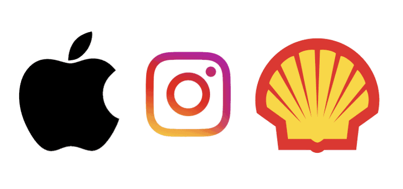
A Symbol logo uses an emblem which represents the brand. Symbol logos use an icon and if used correctly often become ‘iconic’; for example the Apple logo, Instagram logo or the Shell logo. As you can see, each of the logos below are a symbolic representation of the company’s brand name. Symbol logos use only the icon, so it is great for well-established brands but can be difficult logo type for new companies without strong brand recognition.
If you want a symbol logo, but don’t want the symbol to be related to your brand name, you can base the symbol off of an emotion or desire your brand evokes. For example, Nike’s Swoosh check mark symbol evokes the feeling of inspiration and motivation with a symbol that resembles movement.
Abstract Mark Logo
An abstract mark logo is similar to a symbol logo, but rather than using an image which represents the brand- such as an Apple or Shell- an abstract geometric image is used instead.
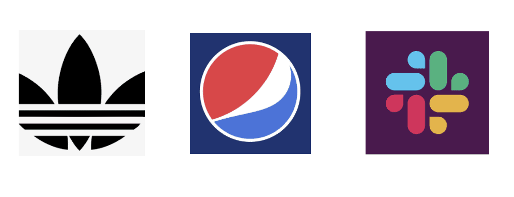
Abstract mark logos are great because they use an image to represent the entire brand. Pepsi’s Red-White & Blue circle along with Adidas Stripes are examples of iconic abstract mark logos. Since abstract mark logos do not have to be recognizable as an image, they can be a truly unique design.
Consider a Symbol Logo if your brand has a name that can easily be communicated with a recognizable image. For example, Peter’s Hockey Instructional could benefit from a logo with a stick symbol.
Consider an Abstract Mark Logo if you want to use an icon to represent your brand, but you cannot easily attribute an image to your name or you want to have an icon which is unique. For example, Smith’s Software Engineering firm may want to use a uniquely designed image to represent their brand because it is not easy to attribute an image to software engineering.
Both Symbol and Abstract Mark logos are great for international businesses in which a symbol can easily be translated into every culture or language.
Mascot Logo
Why does every sports team have a mascot? The answer: because mascots are fun, they drum up excitement and they create a personality to represent your team or brand. Mascot logos use an illustrated character to represent your brand while also creating an ambassador for your message.
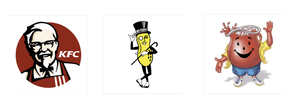
Mascots create a wholesome atmosphere and are best suited for brands who appeal to families and children. Famous mascots include the Kool-Aid Man, KFC’s Colonel and Planter’s Mr. Peanut.
Mascots are great for inspiring customer interaction and creating a personality for your brand. The Kool Aid man is youthful, enthusiastic and energetic, this personality is then transferred to people’s perception of Kool Aid. Geico’s uses their charismatically dry witted Gecko to add a relatable personality to their company.
Companies that have mascot logos may also use another type of logo for their secondary logo so that they can use it on different marketing material. For example, adding the Kool-Aid man to your business card may not be too appealing, so Kool-Aid also has a wordmark logo to use in other contexts.
Combination Mark Logo
A combination mark combines typography (wordmark or lettermark logo), with an image (symbol, abstract mark or mascot logo). This gives your brand the best of both worlds!
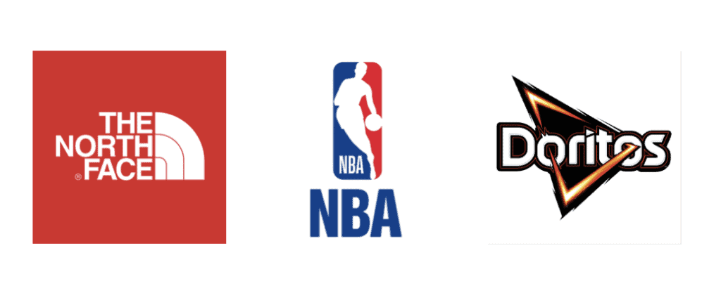
Some well known combination mark logos include The North Face, NBA and Doritos
Combination marks are great because they allow your customers to associate a symbol with your brand name immediately. This allows for incredible versatility because you can choose to simply use the symbol or the typography to represent your brand depending on the context. When together, this gives you both your brand name and typography to reinforce your brand.
For that reason a combination mark is a great choice for many businesses. It’s versatile, usually highly unique, easily trademarkable and popular among many brands.
Emblem Logo
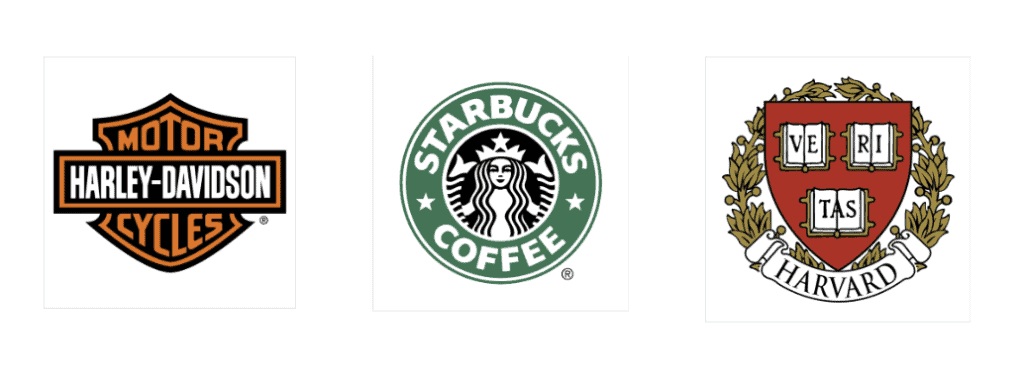
An emblem is a logo with typography inside an icon, badge or crest. These logos have the appearance of being a badge for a club or group, thus evoking feelings of VIP or exclusivity. These logos can often look traditional, as is the case of the Harvard logo or they can be modernized such as the case with the Starbucks logo,
Emblem logos are a great choice for financial institutions, automobile/ vehicle manufacturers, private businesses, Universities and many other business types. Any business which aims to evoke feelings of legitimacy, authority and trust, can benefit from an emblem logo.
Logo Usage
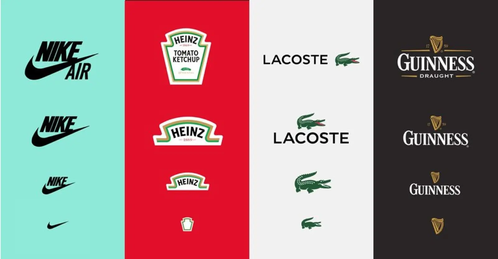
Primary Logo
Your primary logo is the main graphic that represents your business and is used most often. Your primary logo should appeal to your target audience and help communicate what you want to mean to them. This logo may include your company’s tagline, website, industry category or geographic location.
- Used most of the time
- Includes full business name
- May include tagline, website, or geographic location
Secondary Logo
The secondary logo is a simplified version of your primary logo. This design may eliminate some text or rearrange the elements to improve readability in small sizes and alternate orientations and dimensions. Secondary logos are intended for online use or when you must resize your logo for different formats.
- Simplified design & text
- Used when the logo is resized small
Submark Logo
A sub-mark logo is a stripped down graphic of your main logo. The sub-mark typically does not include text or the full name of the business. Instead, the sub-mark logo is a graphical shape, drawing, or icon that represents your business. The submark logo is used when the design must be resized to extremely small formats. Submarks should complement your other logos and provide your brand with flexibility that helps maintain consistency.
- Commonly used online and on social media
- Used when logo is resized to extra small formats
- Includes single letter(s), number(s), or symbol
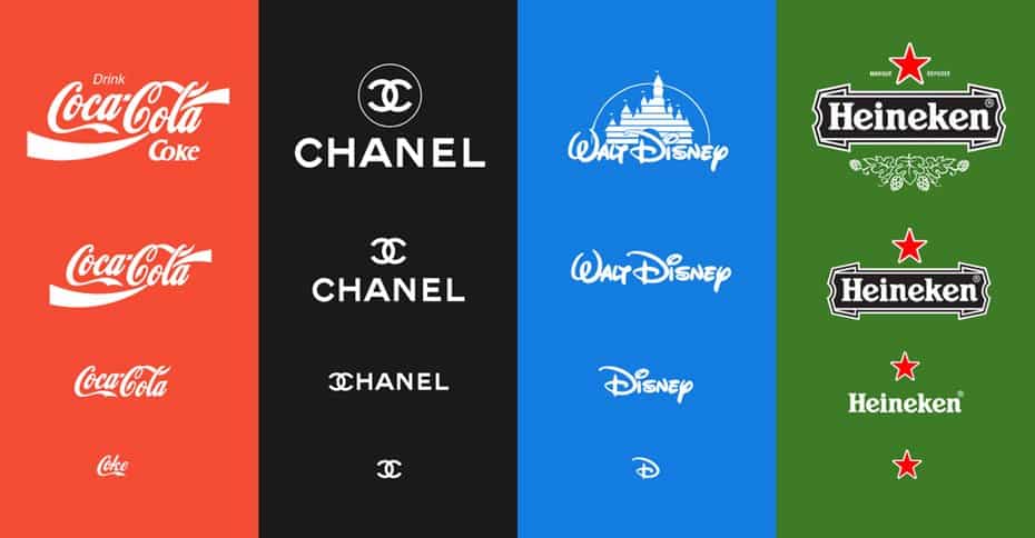
Responsive Logos
Logo’s should be responsive to enable versatility in various environments. This creates a professional, cohesive look and feel that expresses the brand across all touch-points.
The world’s greatest brands have built a strong brand visual expression that helps express their brand’s meaning, personality, positioning, essence and message. Your brand visual expression needs to translate well online, print and on merchandise. Your brand strategy ensures your visual tactics accomplish your business objectives. If you overlook your visual strategy you put your business at a disadvantage and run the risk of not expressing your brand effectively.

