
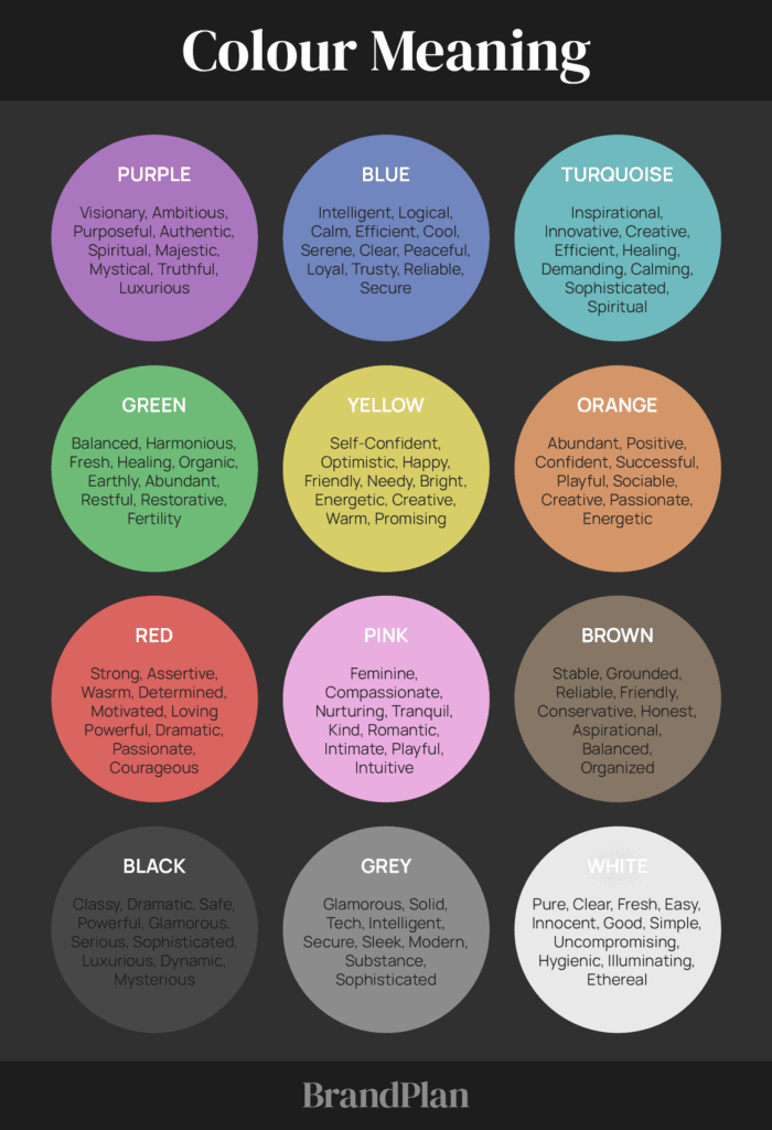
Create Meaning With Colour
Select 1-3 dominant colours and 3-4 secondary colours to represent the meaning you are creating for your brand.
Colour Palette
Tones, tints, and shades have an effect on how we perceive colour.
Tones are created by adding black and white to pure colors. You often hear people saying that a color needs to be “toned down,” meaning it’s too intense and they want to drop the level of intensity. Adding different amounts of black and white to a color subdues the intensity.
Shades of color are created by mixing a pure color with black. They communicate a more mysterious, dark feel, and they’re often considered more masculine.
Tints of color are created by mixing a pure color with white. They convey a lighter, more peaceful, and less energetic feel and are also considered more feminine.
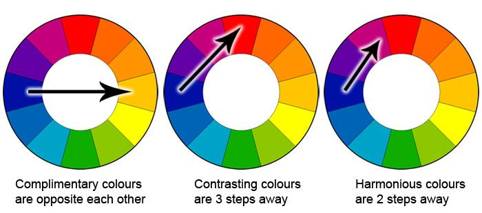
Complementary colors are opposite each other on the color wheel, so complementary palettes often include both warm and cool colors.
Monochromatic color palettes include many tints and shades of a single color. They are soft and subtle, but they can often make brands appear washed out because they lack contrast.
Colour Palette Examples
Create Your Brand Colour Palette
See your BrandPlan archetype for a colour palette inspiration and upload to your BrandPlan.

